From empty canvas to scheduled PDF, in seven steps.
Follow a real example — a Sales Dashboard with charts, a top-products table, AR aging, and a map of next week's deliveries — from creation to delivery.
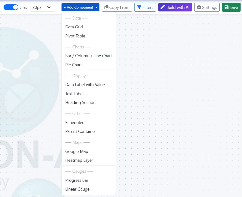
Drag in the components you need.
Open a new dashboard and the designer gives you a blank, snap-to-grid canvas. Click + Add Component and pick from the library — Data Grid, Pivot Table, Bar / Column / Line Chart, Pie Chart, Heading Section, Google Map, Heatmap Layer, Scheduler, Progress Bar, Linear Gauge, and more.
Use Snap and the grid setting to keep everything aligned, and Copy From another dashboard to reuse components you've already built.
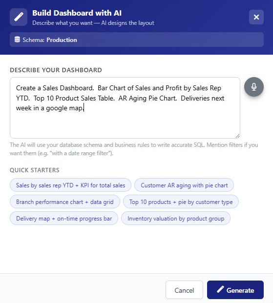
Build Dashboard with AI.
Skip the manual layout entirely. Describe what you want — "Create a Sales Dashboard. Bar Chart of Sales and Profit by Sales Rep YTD. Top 10 Product Sales Table. AR Aging Pie Chart. Deliveries next week in a google map." — and AI generates the components, writes the SQL, and lays them out on the canvas.
Quick Starter chips help you get going fast — Sales by sales rep YTD, Branch performance chart, Inventory valuation by product group — pick one and refine from there.
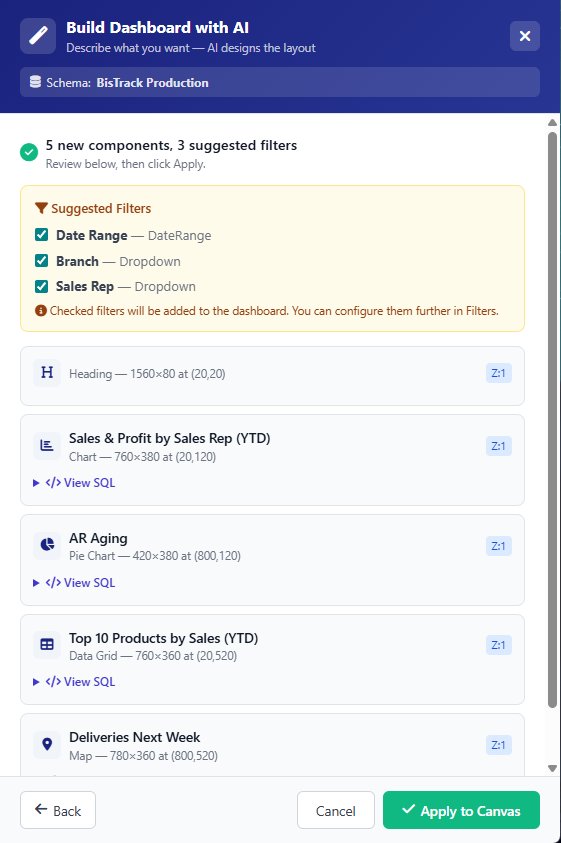
Five components, three suggested filters.
Before anything lands on your canvas, Vision-AI shows you exactly what it's about to create — every component with its size, position, and a View SQL link so you can inspect the query. A Suggested Filters panel proposes shared filters across the dashboard, like Date Range, Branch, and Sales Rep.
Check or uncheck what you want, hit Apply to Canvas, and the dashboard renders. Go Back to refine the prompt, or apply and iterate from the designer.
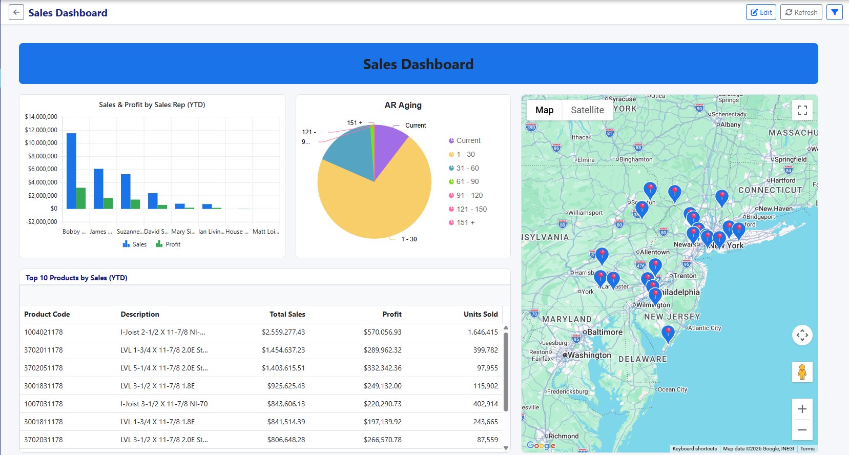
A live, interactive dashboard.
Click Apply and the dashboard renders against live data from your SQL Server. The Sales & Profit bar chart shows every rep's YTD numbers. The AR Aging pie breaks down receivables by bucket. The Top 10 Products grid lists product codes, descriptions, sales, profit, and units sold. The Google Map shows pins for every delivery scheduled next week.
Everything is interactive — click a chart segment to filter, sort the grid by any column, pan and zoom the map, switch to Satellite view. Hit Refresh to re-query, or Edit to jump back to the designer.
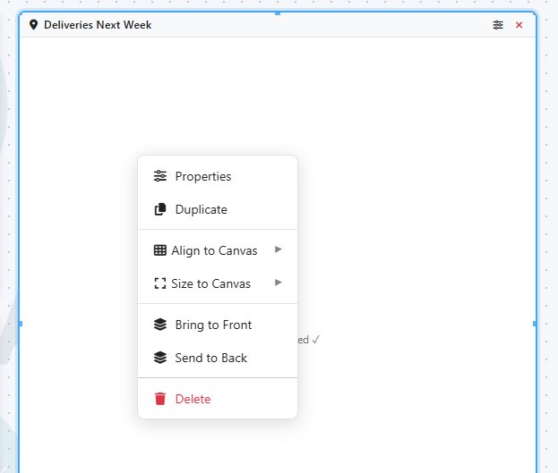
Context menus on every component.
Right-click any component on the canvas for instant access to Properties, Duplicate, alignment, sizing, and z-ordering. Bring something to the front, align it to the canvas, size it to fill the page — all without leaving the designer.
Duplicate a chart and tweak the SQL to create a variant. Delete a component you don't need. The whole canvas behaves like a real layout tool, not a fixed template.
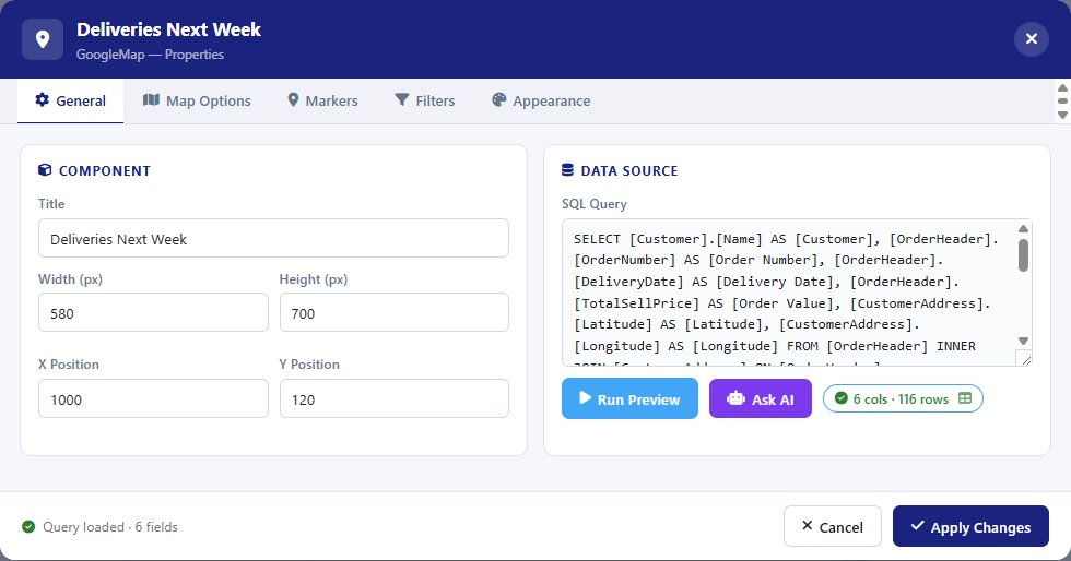
Tabbed properties — tailored to each component.
Open Properties and the dialog shows tabs specific to that component type. Every component has a General tab — title, size, position, SQL query — and most have an Appearance tab. Beyond that, the tabs change to match what the component actually needs: a chart exposes Series and Axes, a data grid exposes Columns, a Google Map exposes Map Options and Markers, and so on.
The General tab's data source panel shows the live SQL with a query-loaded status, column count, and row count. Hit Run Preview to test the query, or Ask AI to refine it in plain English — "add a filter for branch", "sort by delivery date" — and the AI rewrites the SQL in place.
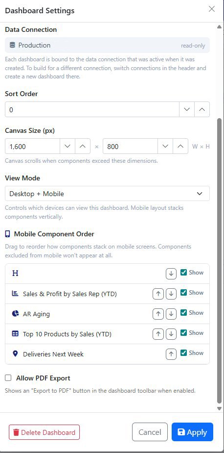
One dashboard, two layouts.
Dashboard Settings handle the cross-cutting stuff — Data Connection (locked to whatever was active when you created it), Sort Order, Canvas Size in pixels, and View Mode: Desktop only, Mobile only, or Desktop + Mobile.
When mobile is enabled, the Mobile Component Order list lets you drag components into the order you want them stacked on a phone. Hide components from mobile entirely with the Show toggles.
Flip Allow PDF Export on and an Export button appears in the dashboard's toolbar inside Vision-AI — handy for ad-hoc snapshots while you're viewing the dashboard.